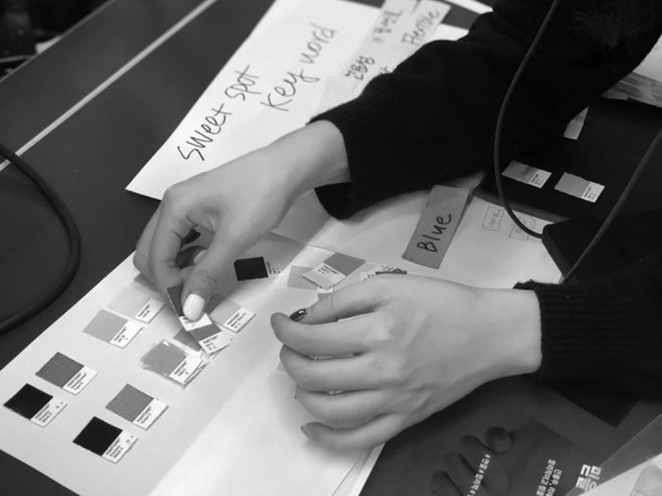
Background & Key Issues
Sweetspot is a pop-up store brokerage platform that connects space and brand. Building owners are provided space utilization and additional revenue while retail brand are provided more distribution channels for reaching customers. Growing to be the largest service provider of its kind domestically, Sweetspot needed a brand identity that could be used both online and offline as the business expanded. To do this, a new brand concept needed to be defined and logo and corporate identity needed to be created.
Approach & Solution
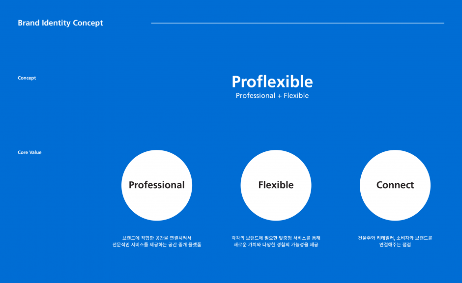
Giving Sweetspot the appearance of "proflexible"
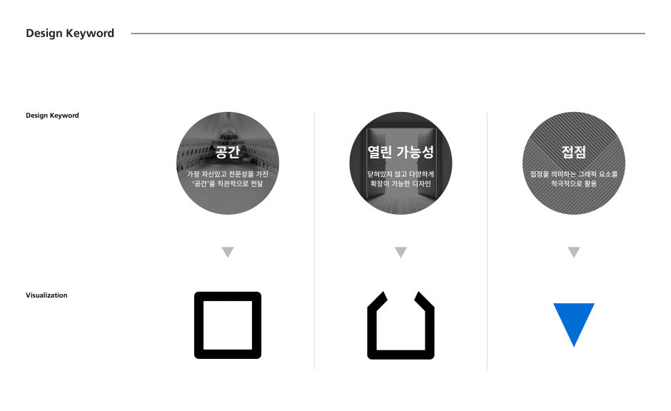
The three keywords were translated into the corresponding graphic motifs, "space," "open possibility," and "contact." These were then used to create a corporate identity, which allowed customers and internal members to truly see the "sweet spot."
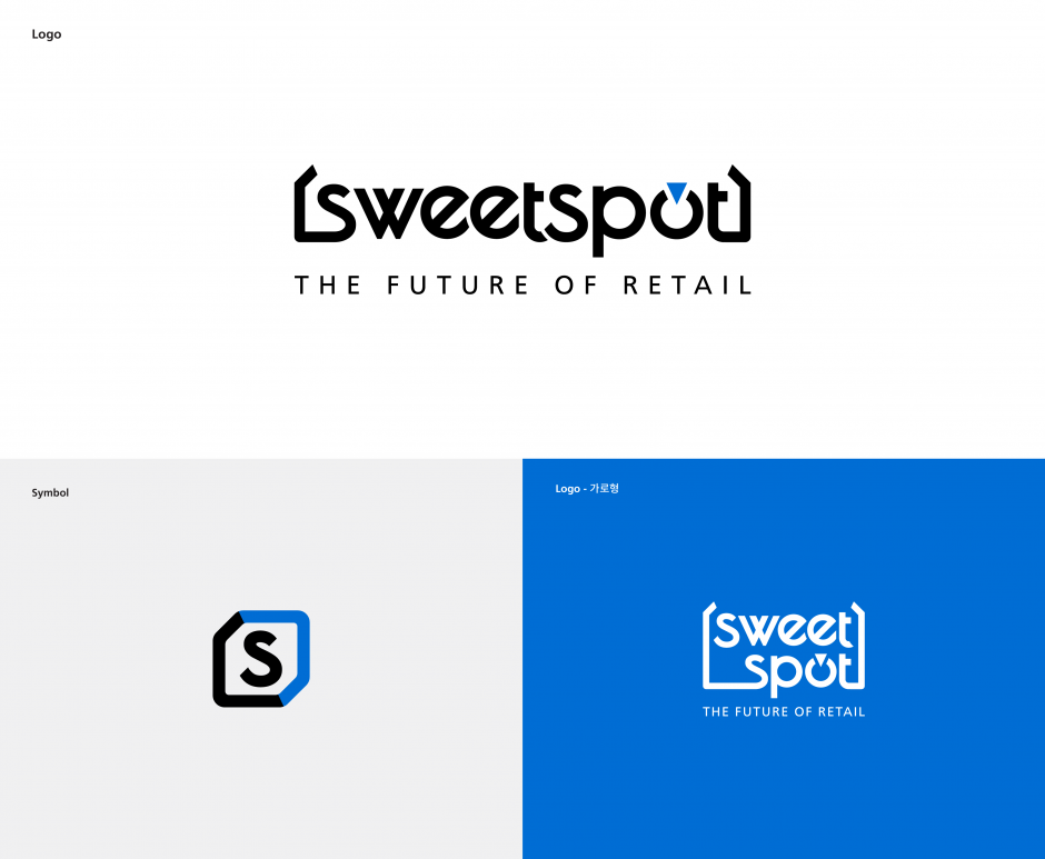
Brand Identity Design
The three visual motifs, collectively, represented an open space where various brands and collaborators can connect, as well as an interface between the brand and the customer.
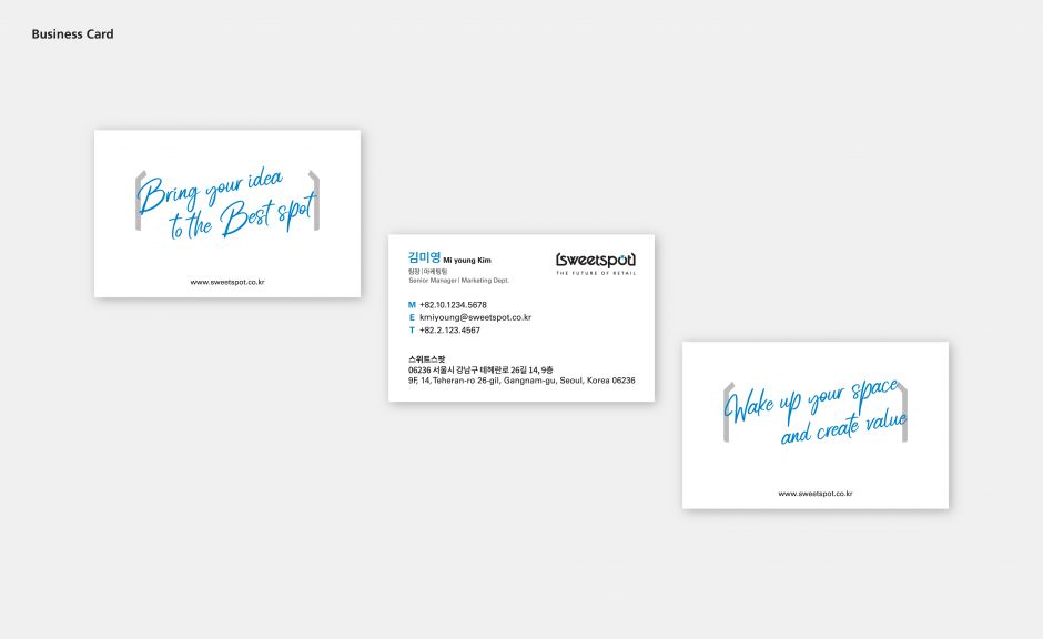
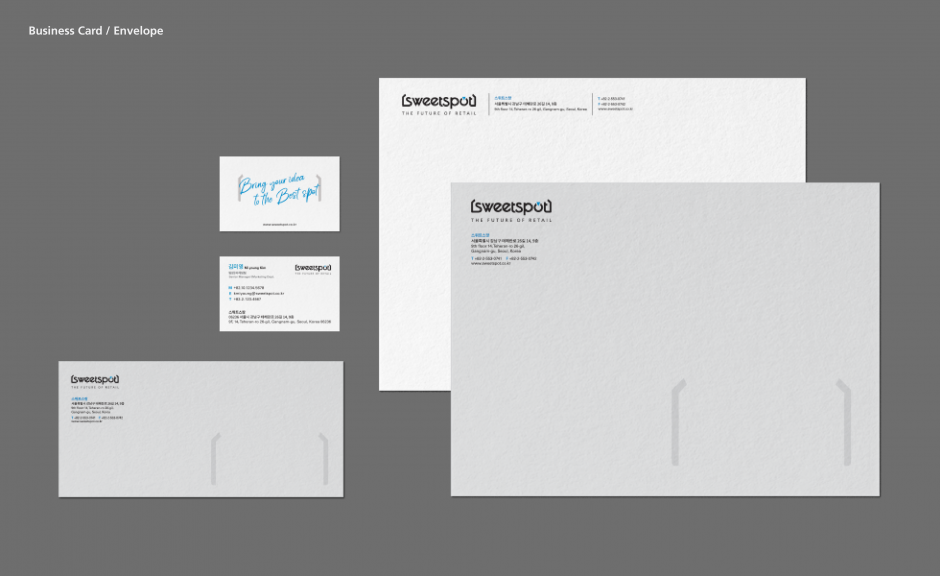
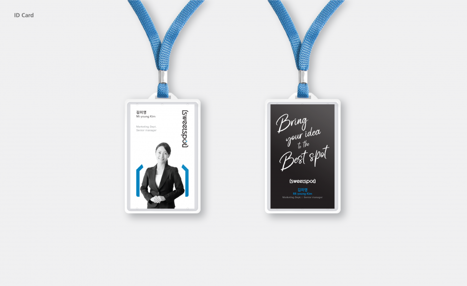
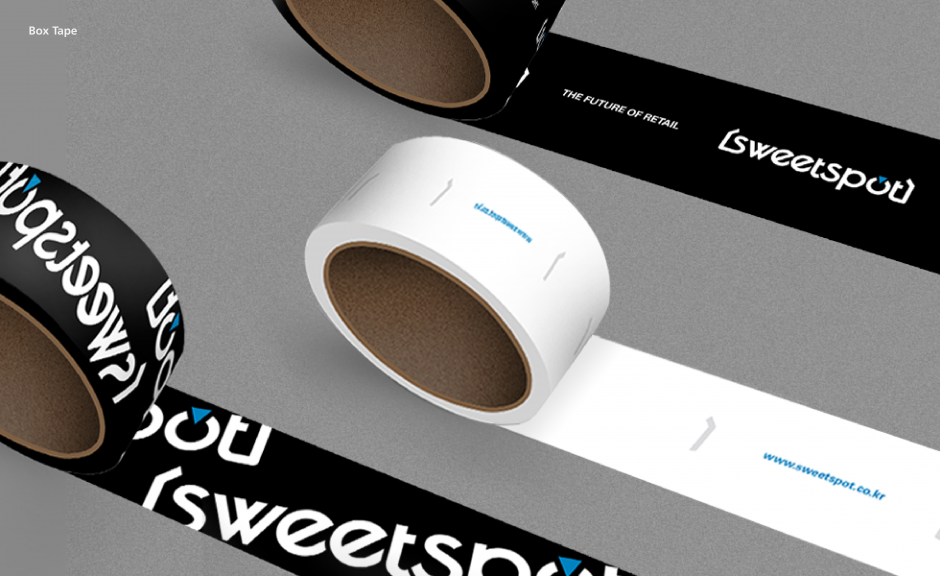
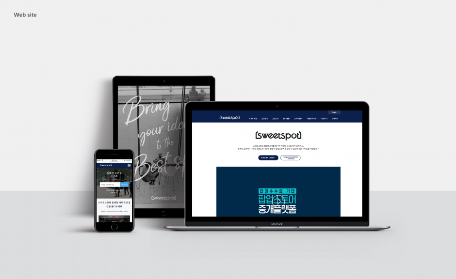
Application Design
Corporate design was created to actively demonstrate the brand identity of Sweetspot as well as deliver a consistent brand experience.

